Case Study: Seequent 3D Web Visualization
Project Overview
| Role | UX Designer |
| Description | A web based 3D visualization tool for visualizing geological data and team collaboration. |
| Problem To Solve For | Creating a MVP that combines the best features from the company's existing visualization tools, with improved usability. |
| Goal | To design a tool that feels familiar and is easy-to-use for existing users with a technical or semi-technical role. |
| Challenges | Designing a new layout users could understand even though their current mental model was built around the company's desktop-based visualization tools. |
| Learnings | Learned to break down complicated user workflows into smaller steps or tasks in order to design a layout that is approachable for users at any technical level. |
| Prototype Tool(s) | Marvel, Sketch |
| Link(s) | Prototype #1 Prototype #2 MVP release video (start at 8 min mark) |
Process
I work in mostly collaborative environments. So sometimes you’ll find I refer to the actions taken as “we” rather than “I” since it’s a team effort.
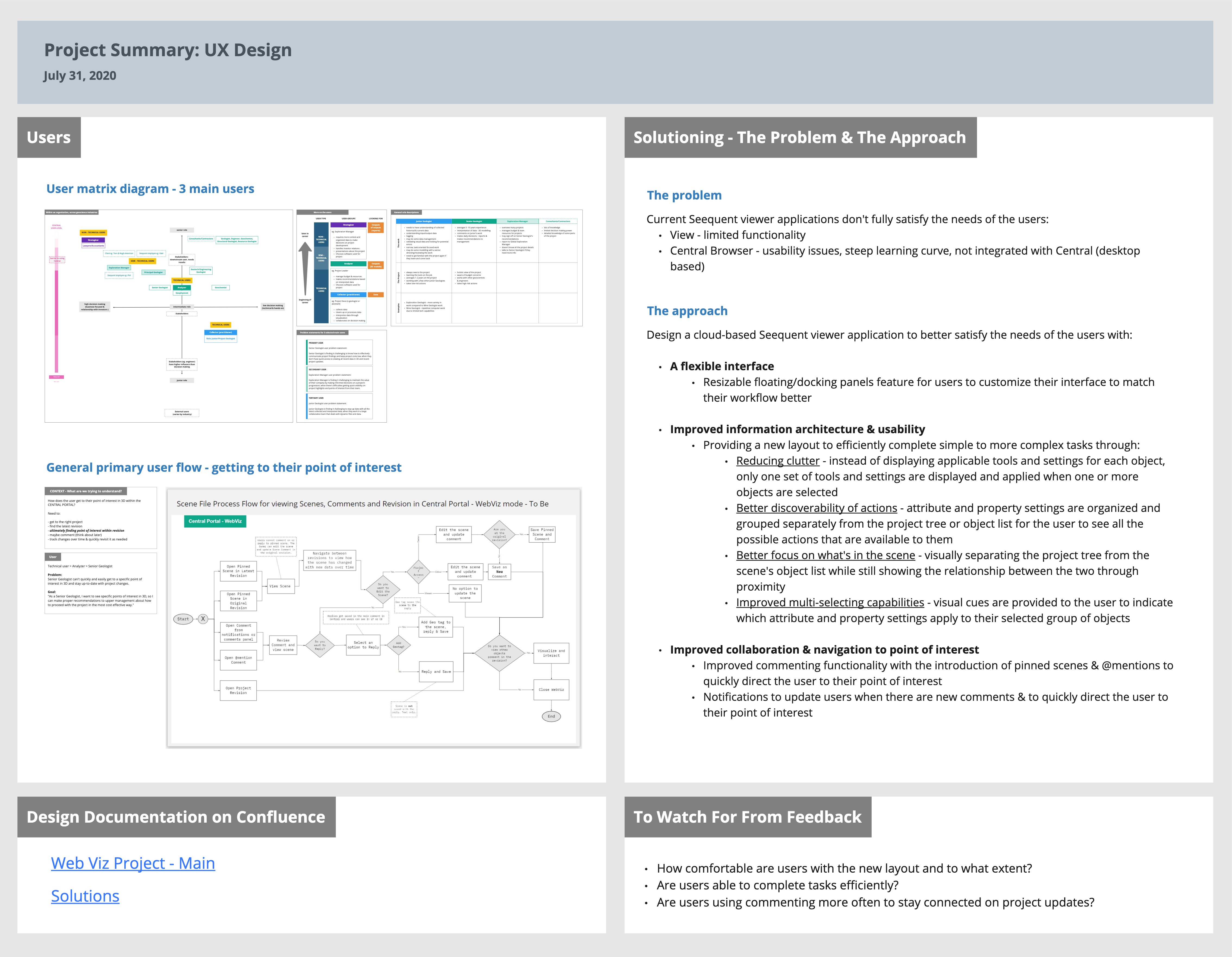
1. User Story Mapping and User Matrix Diagram
Through working with the Product Owner, we aimed to understand the users and how they would use this tool. With the wide range of potential users, I created a user matrix diagram to help determine our primary, secondary and tertiary users. I also created a story map to help us see what tasks the user would need to do to reach their goal.
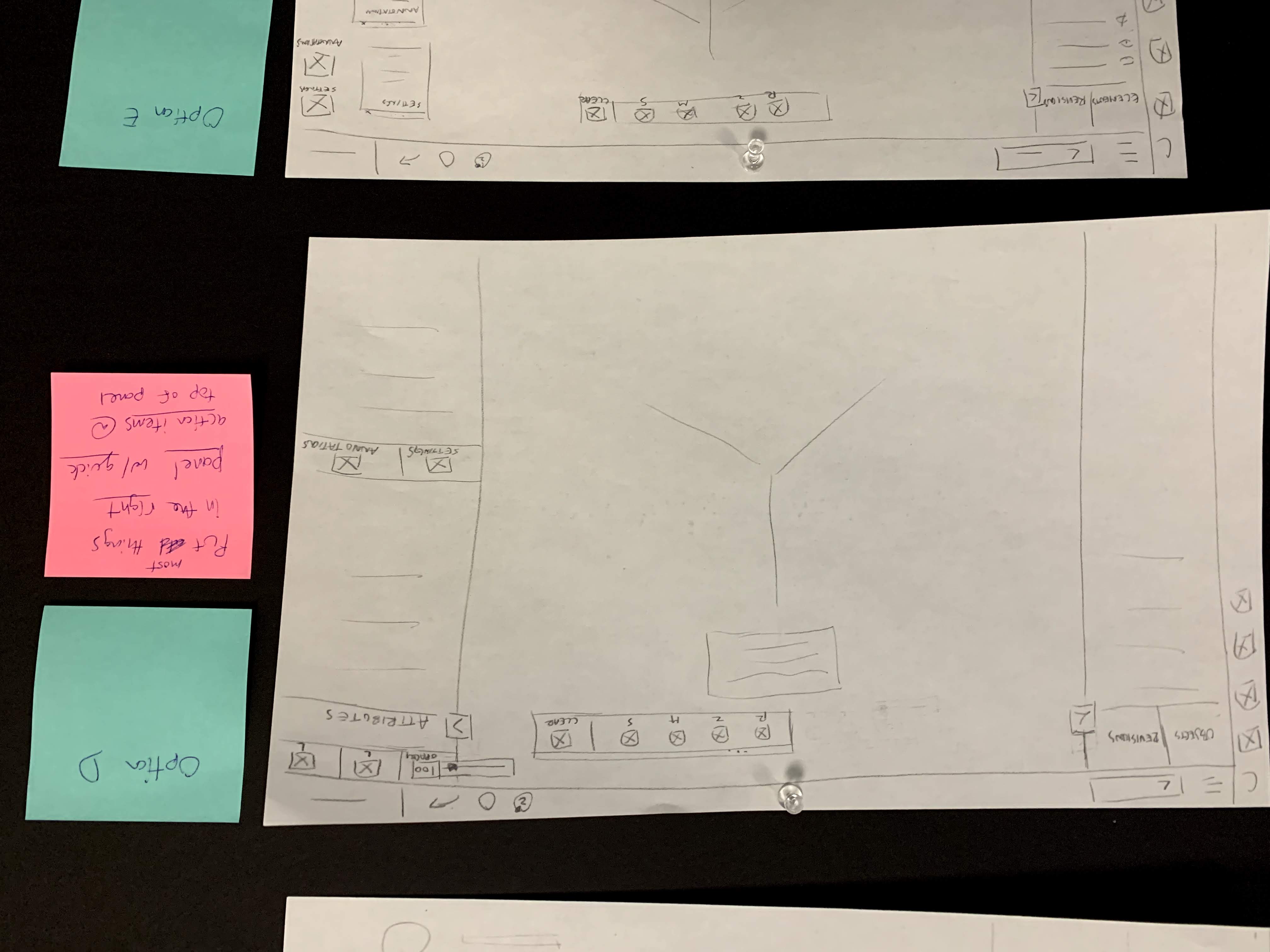
2. Layout Sketches
To quickly explore all the layout possibilities of this tool, I drew a few sketches to use for discussion with the Product Owner and UI Designer. Some sketches were based on existing patterns, while some explored new ones.
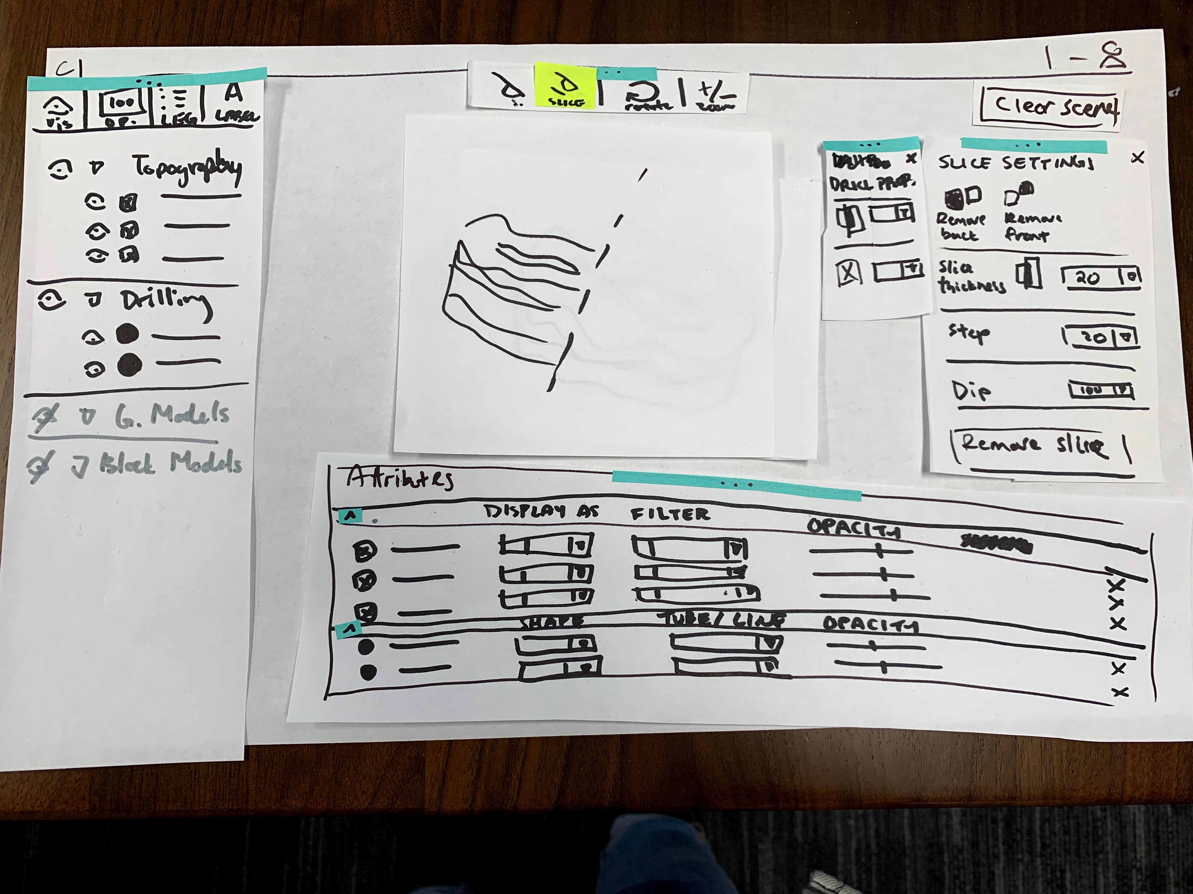
3. Paper Prototype
After narrowing down to a couple possible layouts, we wanted to see how it might feel to our users to interact with these potential interfaces. Bringing in the Product Manager and a Developer, we all took turns to piece together paper prototypes, which we then tested amongst each other.
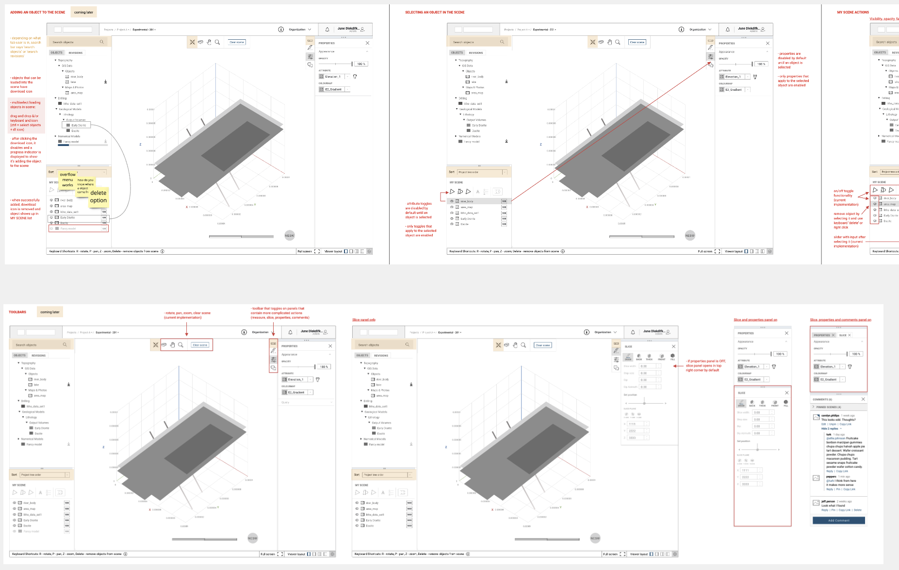
4. Low-Fidelity Prototype
The chosen paper prototype was then transformed into a low-fi prototype for internal testing. I typically uncover more questions and details that require further examining, since one action could lead to more than one possible outcome.
Feedback Time
5. Internal User Testing
To uncover common usability problems with the layout, 3 test sessions were set up.
6. Feedback and Iterate
Through the test results, we decided what tweaks were essential for the next iteration that would be used for external testing. This was also a good time to look into potential edge cases.
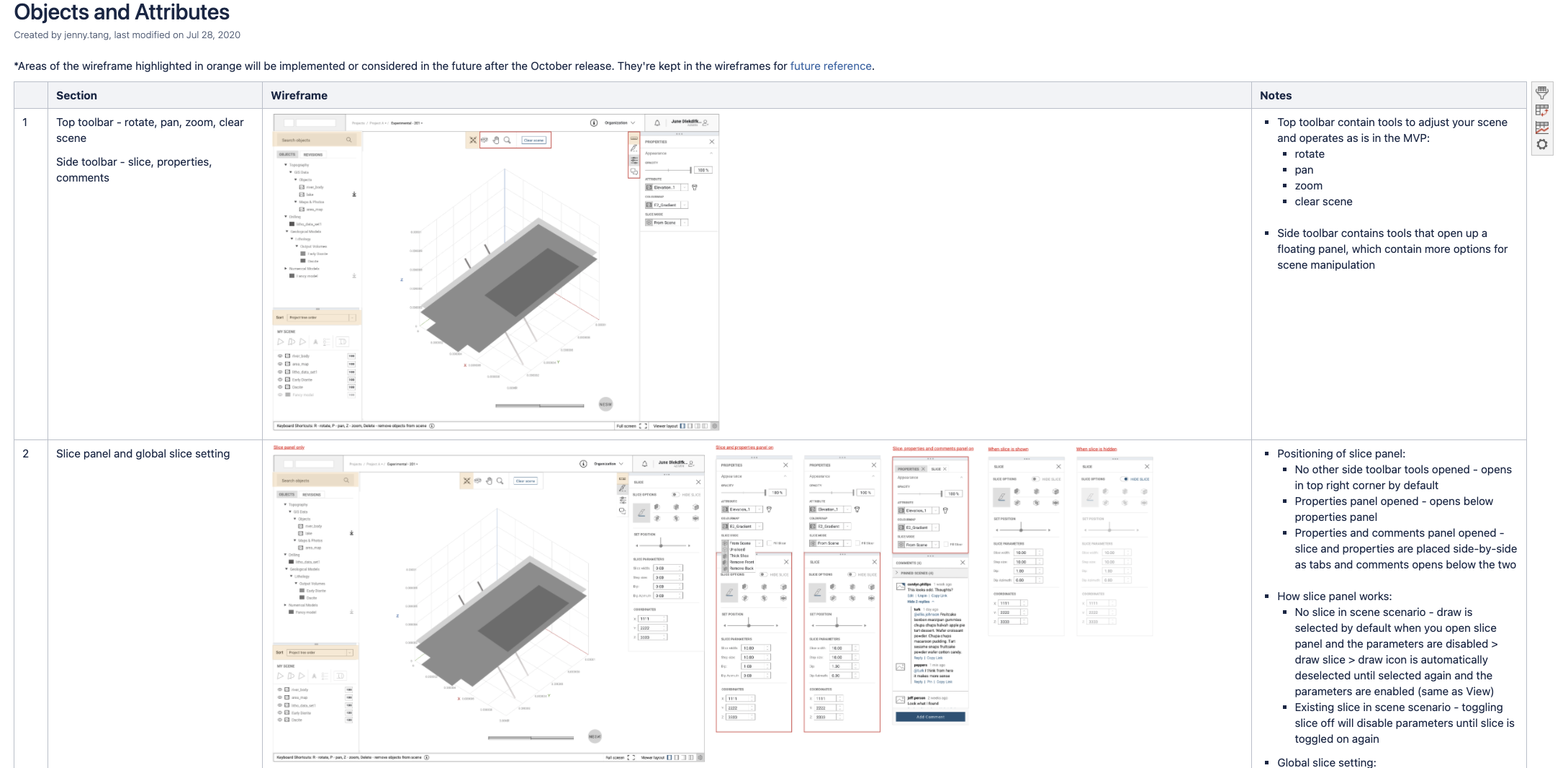
7. UX Documentation and Assistence
After the second round of testing with real customers and a few more iterations, I prepared UX documentation to assist the UI and development teams as they start working on it. The Confluence documentations focus on the different use cases, interactions and edge cases that stem from the new layout.
MVP Release
Here's a link to learn about the MVP release of this tool. Starts at the 8 minute mark.